
Historical Nominal and Real Treasury Yields and Stock Returns
From theitalianleathersofa.com/the-risk-…
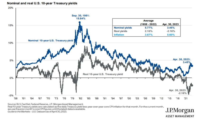
The blue line represents what you think you earn, the grey line is the (sad) reality….when inflation starts to run (often, unannounced), investors lose money fast.
Nominal vs Real for Stocks
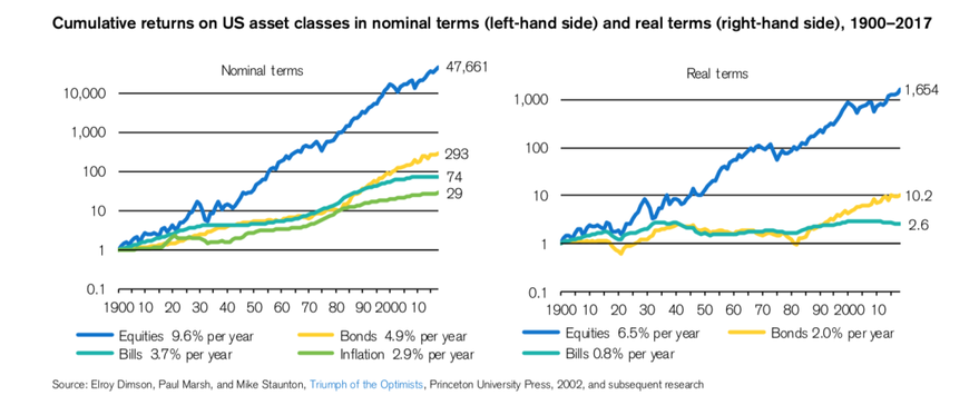
In the graph on the left hand side the yellow line looks quite enticing. However, when you look at the right hand side, the same asset didn’t go anywhere for 80 years – 80 years during which cash performed better by any metric you consider. Sure the last 45 years (minus 2022) have been great and are the best example on why you would want to hold some bonds